Touch Bible Free
1.0 out of 4 stars –

We really need more than this.
Touch Bible Free by Patrick Franklin leaves so much to be desired. The app is truly barren, with limited features.
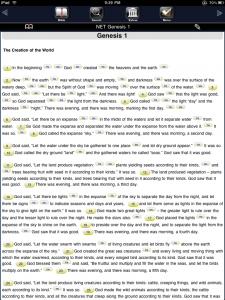
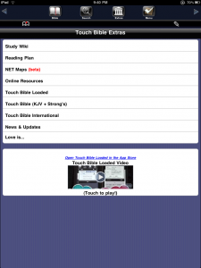
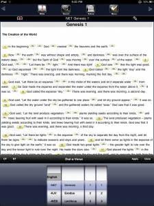
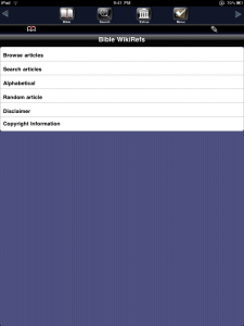
Upon opening the appIication I was shown (no surprises here) Genesis 1:1. A menu bar across the top presented 6 buttons: Back, Bile Search, Extras, Menu, Forward. The “Bible” button opened…you guessed it: The Bible. If you were already in the Bible and tapped the button, a little “Dial-a-verse” feature popped up on the bottom of the screen. Search functionality is basic, with options for the Old Testament, New Testament or All. “Extras” required a connection to the internet, and brought up a study wiki, reading plans and a couple other options, including a link to buy “Touch Bible Loaded”.
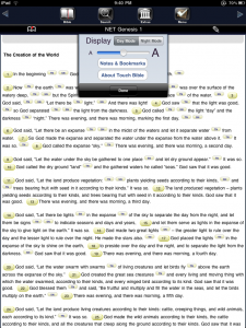
The customization options for the user are, frankly, pathetic. The only options are “Day Mode” (black text on a white screen), “Night Mode” (white text on a black screen) and an option to change font size. “Night Mode” was particularly headache inducing. It didn’t look like E-Ink, just a dark black screen with white text.
List of Features
Pros
Cons
Conclusion
This is by far the one of the poorest apps I have ever used on my iPad. Poor implementation, confusing interface and lack of content doom this app for quick deletion.
1.0 out of 4 stars

{ 1 comment… read it below or add one }
Sounds like a real piece of garbage!